Essentials by Ellen March Release Sneak Peak Cards:
Watercolor Stamping and Backgrounds + GIVEAWAY

Hello! I am so thrilled to be guest designing for Ellen Hutson, and it was so fun to work with such a unique release -available for purchase on Sunday March 4th. And today I’m going to use most of this release in a technique I adore – creating watercolor looking backgrounds and stamping without actual watercolor. Also make sure to read to the bottom to see how you could win a $50 gift card to Ellen Hutson!
We all love distress ink backgrounds, but with watercolor stamping on top you can create another great look. I picked my color palette and then found the lightest shades of distress inks and blended them on my card stock. For the most watercolor-esque look, blending the colors in random places helps create the look.

As you can see in the photo, my blending is not perfect, which is fine for this technique. Then I took some pretty images from the “So Matcha” stamp set and arranged them into a cluster on my acrylic block. I then took the same colors of distress inks I used on my background and pressed them onto my images, making sure they overlapped. (Tip: when using analogous colors, you can usually just press directly onto your stamps, but if you’re using very different colors, use a small ink blender so you don’t contaminate your ink pads).

Another tip, because these images have just delicate and intricate lines, I don’t add water to blend the colors together. One, because it’ll look blended enough on the fine lines, and two, because if you add water it will easily bleed out and warp the look of the image. This also makes the images stand out a bit more from our background of the exact same colors.
The blended background plus our blended stamped images give this background a faux watercolor look. If you would like to enhance this look, you can drop water droplets from a brush and let them interact with the distress ink.
To finish off this card, I used the “Fortune Cookie” dies to cut one of the fortune cookie shapes out of Kraft cardstock. I then lightly blended some brown ink to the bottom left part for so minimal shading. This die cuts slits in the fortune cookie where you can slip in the fortune. I am obsessed with this idea – you create your own fortunes! And the sentiments for the fortunes are so awesome – they’re perfect so many different kinds of cards. So I picked out the fortune I wanted from the “Good Fortune” stamp set, stamped it onto the die cut white cardstock and slipped it into the slit.
Also, often when I create full backgrounds like this, I like to help give some visual balance to the card by using some horizontal lines to help break up the expanse of the background. For this card, I used three white stripes of cardstock behind my fortune cookie. I then blended some color onto the edges of them – and I’m not 100% if that was the right decision, but there you go haha.


And the card is done!
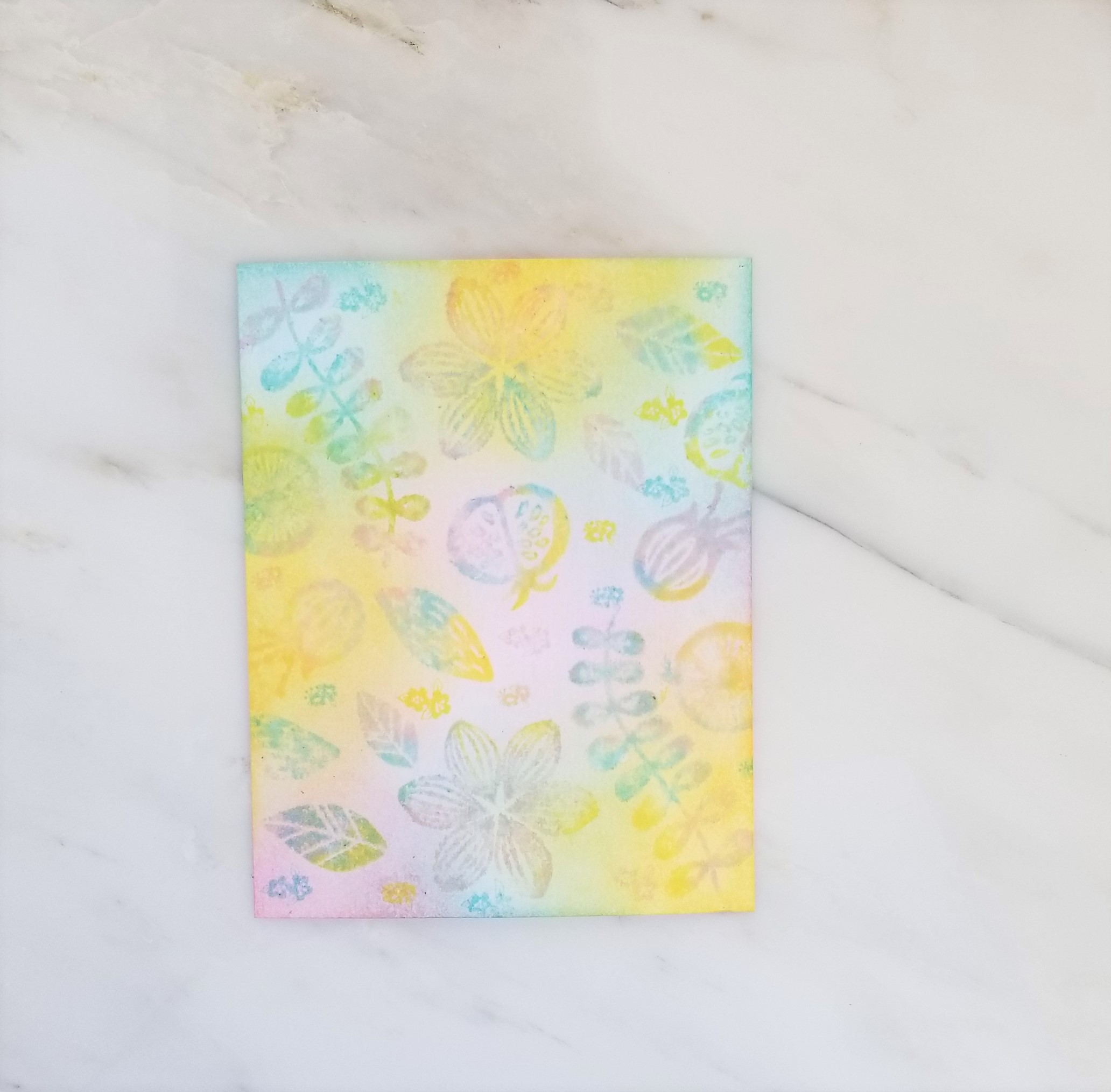
My second is done using the same technique except with larger and thicker-lined images from the “Rustic Flowers” stamp set, so I used 1 or 2 spritz of water to help blend the color and lighten it a bit, which makes the flowers and leaves blend more into the background for a cohesive look. Don’t spray much more than this though, because the images will start to lose their shape. Again, I used the exact same colors for the background as I did for the images.
When you apply your ink to your stamps, either using the mini distress cubes directly or using a finger dauber, make sure to put your lightest color down first, and put down more than you think you’ll need. The lightest colors, especially yellow, will get mixed and lost very easily. When deciding how much or where I want to put my color on the stamps, I honestly only make sure I have a relatively even amount of each color – I don’t think about placement a ton and it always turns out great!
I then added those small clusters of flowers from the “So Matcha” stamp set to fill in any gaps, using the same colors of distress inks. I used the same design for this card – the gold strips of paper to break up the background. Gold or silver papers are a great way to add shine/texture without distracting from colors in a card.


My third card uses the same technique, but uses lighter colors for the background and darker shades for the stamped images. I wanted these beautiful bamboo images from the “So Matcha” stamp set to stand out again the green background we created. I also varied my stamping technique – I alternated between spraying the images with a spritz of water and using no water at all. This also helps to create even more faux texture. In this card, my sentiment was my focal point so I used white strips to frame it. The sentiments are from the amazing fortune cookie sentiment stamp set. I added some gold watercolor splatter for fun.


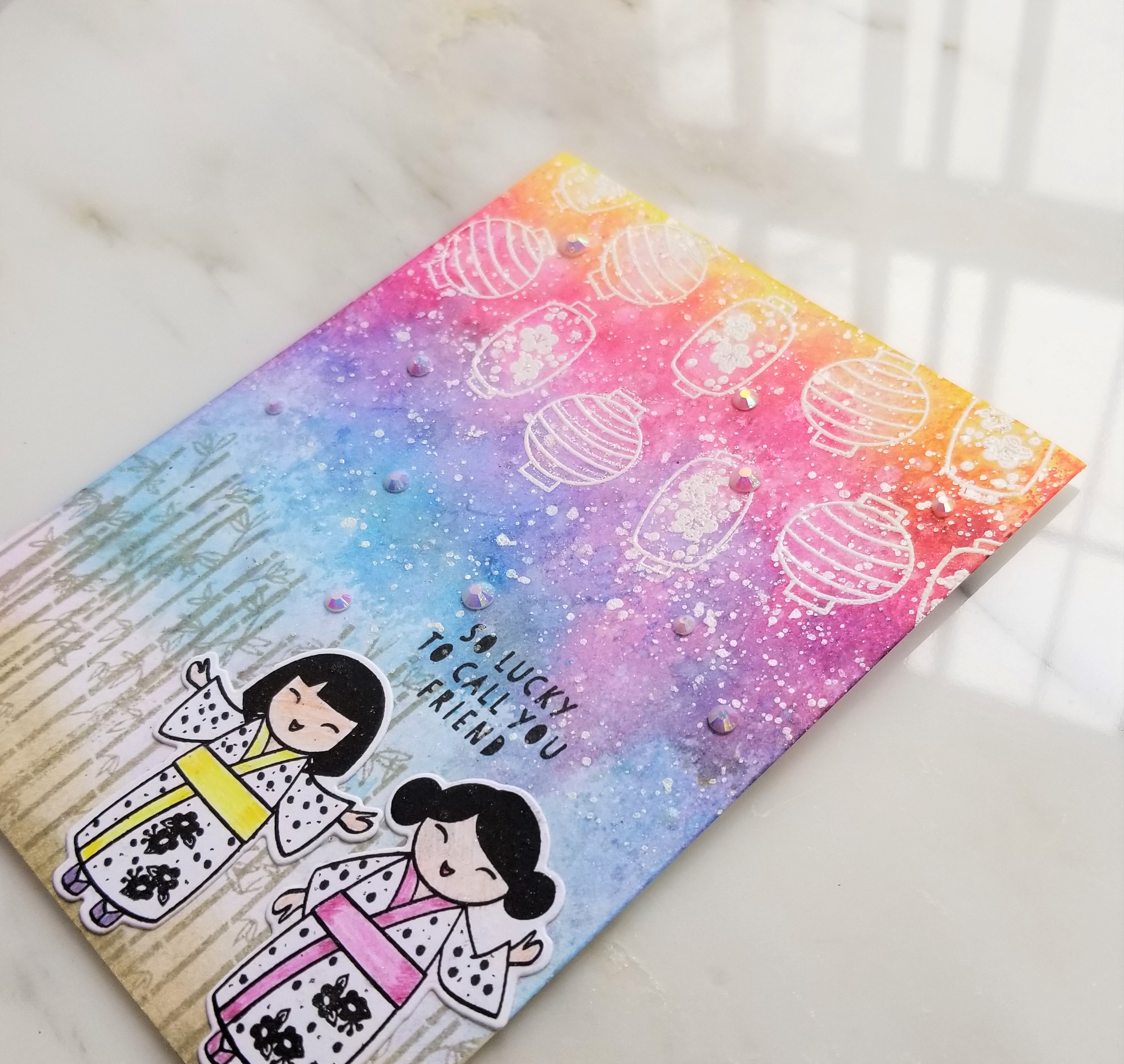
BONUS CARDS: My other two cards are bonus cards because they’re not made with the technique we’ve been using. These are made with actual watercolor backgrounds. This one I used watercolor to create a twilight sky for these pretty lanterns to hang in. I stamped the bamboo lightly in gray so as not to distract from our colorful sky, and added these two cute friends. I added many clear rhinestones in the sky to emulate smaller points of light/lanterns in the sky and added the sentiment right above the girls’ heads.

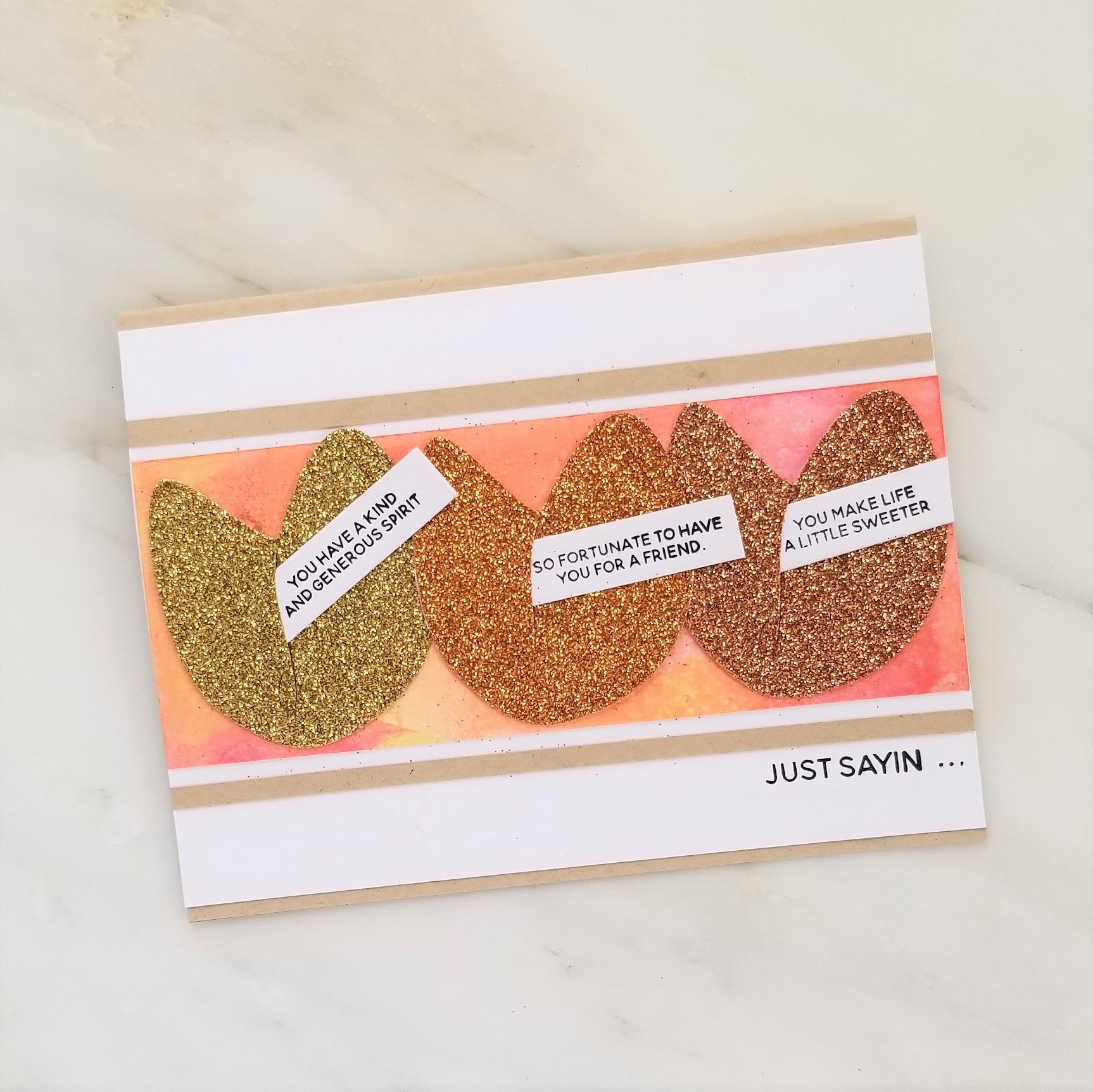
My last card, I used a portion of a yellow and pink watercolor background as a backdrop to our glittery fortune cookies of varying shades of gold. I framed our focal point with Kraft cardstock stripes for a clean look.
Would you like to win a $50 gift card to Ellen Hutson?? All you have to do is leave a comment on this post by March 8th telling me what your favorite card was, and I will announce the winner March 9th!
Products I used:
“So Matcha” Stamp Set
“So Matcha” Coordinating Dies
“Fortune Cookies” Dies
“Good Fortune” Stamp Set
“Rustic Botanicals” Stamp Set
Colors I Used:
Twisted Cintron Distress Ink
Cracked Pistachio Distress Ink
Pine Needles Distress Ink
Peacock Feathers Distress Ink
Tumbled Glass Distress Ink
Salty Ocean Distress Ink
Shaded Lilac Distress Ink
Picked Raspberry Distress Ink
Spun Sugar Distress Ink
Squeezed Lemonade Distress Ink
Thanks so much for stopping by today! Again, it is so awesome to be a part of an Essentials by Ellen release, happy shopping starting March 4th! https://www.ellenhutson.com/this-just-in
